Role:
Design Lead
Principal Designer
2023-2024
Design Lead
Principal Designer
2023-2024
McDonald’s DLS
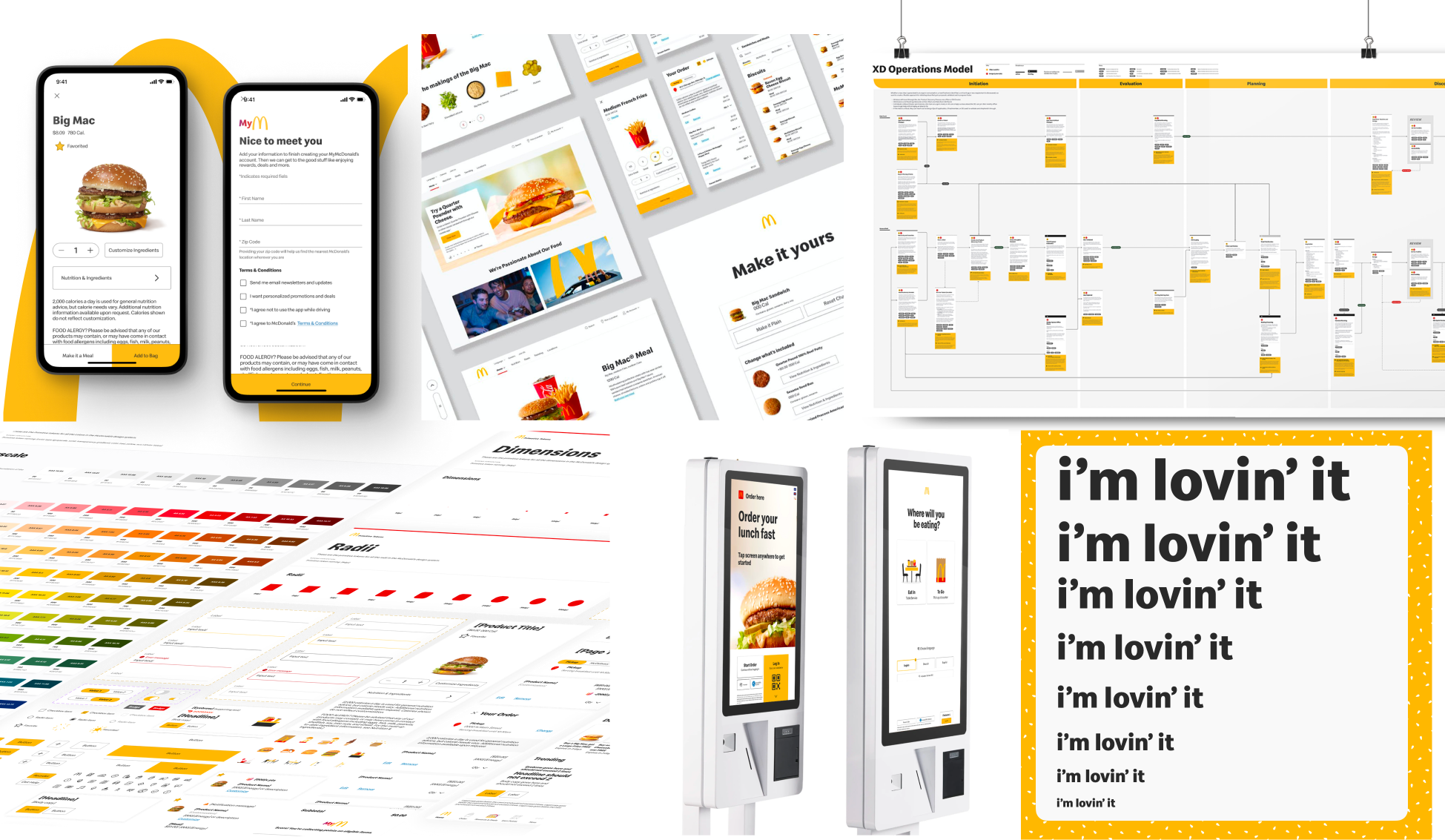
Evolve and scale McDonald's Design Language System (DLS) to operate as an internal product that serves all digital properties by enabling teams with a flexible and up-to-date toolkit to enable greater consistency, flexibility, and efficiency.
Evolve and scale McDonald's Design Language System (DLS) to operate as an internal product that serves all digital properties by enabling teams with a flexible and up-to-date toolkit to enable greater consistency, flexibility, and efficiency.

The challenge:
McDonald’s, like many other large organizations with a global presence, was facing a common issue of providing consistent experiences across their local markets. To tackle this problem, McDonald's wanted a partner to improve their design system and operations model, enabling consistent digital experiences across channels and locations.
McDonald’s, like many other large organizations with a global presence, was facing a common issue of providing consistent experiences across their local markets. To tackle this problem, McDonald's wanted a partner to improve their design system and operations model, enabling consistent digital experiences across channels and locations.
Approach:
frog conducted 18 interviews across product, engineering, and design teams, and identified pain points in discoverability, design-dev alignment, and product consistency. To address these issues, we implemented a design system with guidelines and a scalable governance model that equips teams with the necessary tools for delivering high-quality products.
frog conducted 18 interviews across product, engineering, and design teams, and identified pain points in discoverability, design-dev alignment, and product consistency. To address these issues, we implemented a design system with guidelines and a scalable governance model that equips teams with the necessary tools for delivering high-quality products.
Outcome:
In tight collaboration with the McDonald’s DS team, we created 3 key deliverables:
1. A governance and operations playbook that outlined how teams could use and contribute back to the DLS.
2. Dynamic, scalable Figma libraries built with variables (tokens).
3. A UI token toolchain that automated the translation of design tokens into working code.
Governance & operations model:
A playbook to provides transparency in the process, streamlines decision-making, and adds structure to help socialize updates/changes across the organization. For McDonald’s, our team paid special attention to accessibility requirements, local market considerations, and involving legal teams, to ensure best-in-class experiences are delivered at scale while meeting the requirements of a global brand.
A playbook to provides transparency in the process, streamlines decision-making, and adds structure to help socialize updates/changes across the organization. For McDonald’s, our team paid special attention to accessibility requirements, local market considerations, and involving legal teams, to ensure best-in-class experiences are delivered at scale while meeting the requirements of a global brand.

Figma Workspace Architecture:
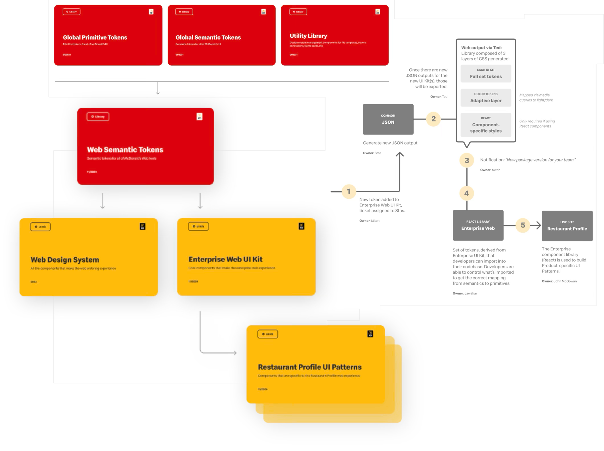
This is a representation of the architecture of the McDonald’s Design System Workspace. A multi-tiered structure keeps work-in-progress and published content separate and resolves toolchain constraints/integration needs. This structure also demonstrates the design token structure and how all McDonald’s digital offerings lead back to a single source of truth closing the gap between design and code utalizing Figma variables.
This is a representation of the architecture of the McDonald’s Design System Workspace. A multi-tiered structure keeps work-in-progress and published content separate and resolves toolchain constraints/integration needs. This structure also demonstrates the design token structure and how all McDonald’s digital offerings lead back to a single source of truth closing the gap between design and code utalizing Figma variables.

Scaling the system for web, for both consumer and enterprise, had global impact.
What we did:
Additional global color modes created to accommodate the 14 unique CTA, overlay and status colors for Enterprise tools.
Centralized file management for web-based tokens for reuse and ease of maintenance; decoupling of components (housed within UI kits) streamlined design & dev without blocking independent UI evolution.
Leveraged versioning to reduce risk of impact on breaking changes on dev side.

Guidelines to empower Designers and Engineers in quality and scalability.
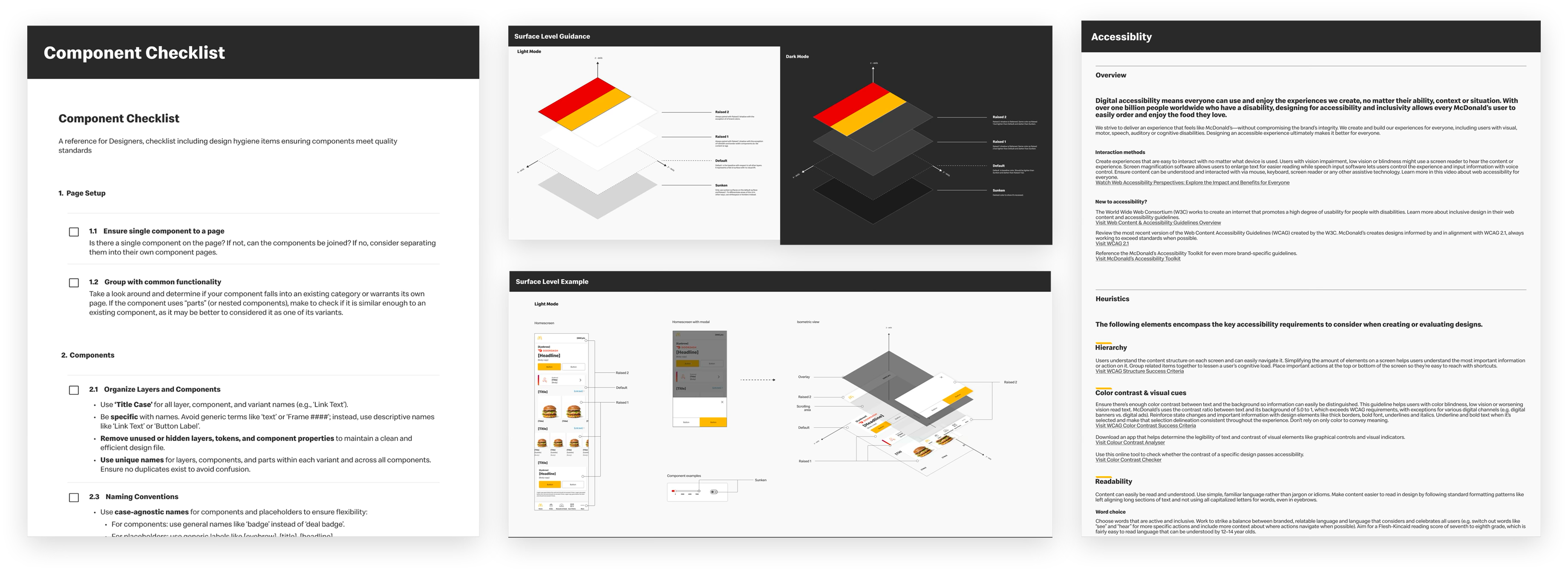
Addressing McDonald’s need for consistency, quality and scale was at the core of our work architecting how the Design System would drive collaboration between product, design and engineering. We worked with the McDonald’s team on a suite of tools, checklists and strategy guides to ensure commitment to Product Management and Design best practices. Types of documentation included:
Branching and Versioning Strategy
Spike or Discovery Guidelines
Accessibility Checklist
Component Checklist

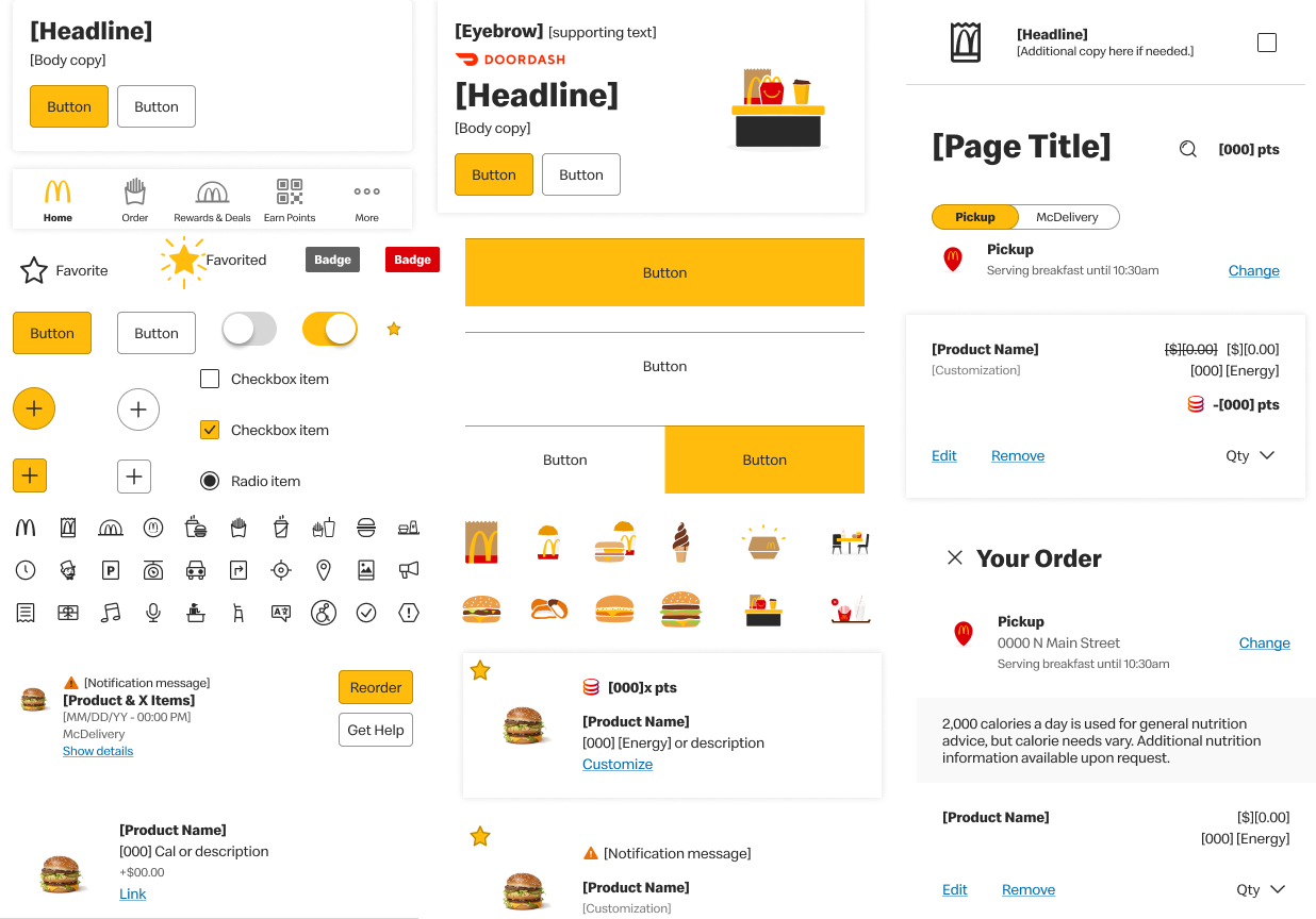
For the cunsumer side, we've prioritized a foundational set of core components, the basic building blocks for any UI.
What we did:
Additional global color modes created to accommodate the 14 unique CTA, overlay and status colors for Enterprise tools.
Centralized file management for web-based tokens for reuse and ease of maintenance; decoupling of components (housed within UI kits) streamlined design & dev without blocking independent UI evolution.
Leveraged versioning to reduce risk of impact on breaking changes on dev side

After creating our prioritized components, we could develop full-page templates of key screen
As a part of our asset audit and consolidation, we’ve added standards to our naming and property conventions, consolidated similar components, and added Figma-native documentation.
As a part of our asset audit and consolidation, we’ve added standards to our naming and property conventions, consolidated similar components, and added Figma-native documentation.
Home
Product Details Page
Bag
Registration
Content
